Reception Signs
Reception signs are essential to making the right first impression in your office’s reception area. Employees, clients, and potential customers will see your reception area when they first arrive at your business.
Businesses should aim for their reception area to be on-brand, while also being welcoming for visitors. In this article, we’ll discuss some pointers to keep in mind when designing the reception area of your business. The goal is to have an inviting and elegant space that makes people feel comfortable.

reception signs
Straightforward Layout
The reception area should have a simple layout that leads visitors from the front door or elevator to the front desk and eventually to the seating area. The pathway should feel natural without any obstacles in the way.
Designers should position decorations such as plants and standing lights out of the main walkway of visitors. You’ll want to include reception signs that reflect your brand along the main path that visitors pass.
NGS Group’s digital printing graphics can be a visual reminder of the brand on the walls. We also have floor decals and banners to match your layout.

Modern Reception Area
Whether your company is a big corporation or a boutique design company, you’ll want the reception area to look clean and refined. Since there’s a lot of traffic for appointments and inquiries, you need to pay special attention to this area.
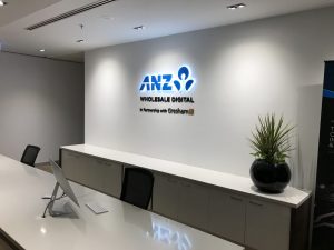
The reception area is a great place to put different types of reception signs. Having clear signage helps people remember your brand. Some of the options NGS provides are reception signs, wall graphics, directional signs, window frosting, and more.
The goal is to give people a positive impression of both your brand and the company as a whole when they walk into the front office. The design should evoke feelings of calmness and professionalism.

reception signs
Color Scheme & Branding
The colour scheme in the reception area should match the colours of the brand. Our experts at NGS Group recommend using neutral or naturally soothing colours in the reception area. This makes the reception signs stand out clearly.
If the company’s colours are very domineering, such as dark red, it may be best to use neutral colours in the reception area. However, if the colours are more soothing, such as a neutral blue, accentuating the reception and office areas with those colours can be appropriate.
The most important thing is that the visitors don’t feel overwhelmed by the colour scheme.

Get Clear Reception Signs
Since a company’s reception area is highly trafficked during the day, people should put a lot of care and effort into designing it. Choosing the right reception and office signage is also essential, as it helps people connect with the brand.
For over 20 years, NGS Group has been providing Australians with top-notch signage and corporate branding.
To get a free quote about your company’s signage, feel free to contact us at 03 9432 7111. We’ll be happy to answer any questions you may have.


