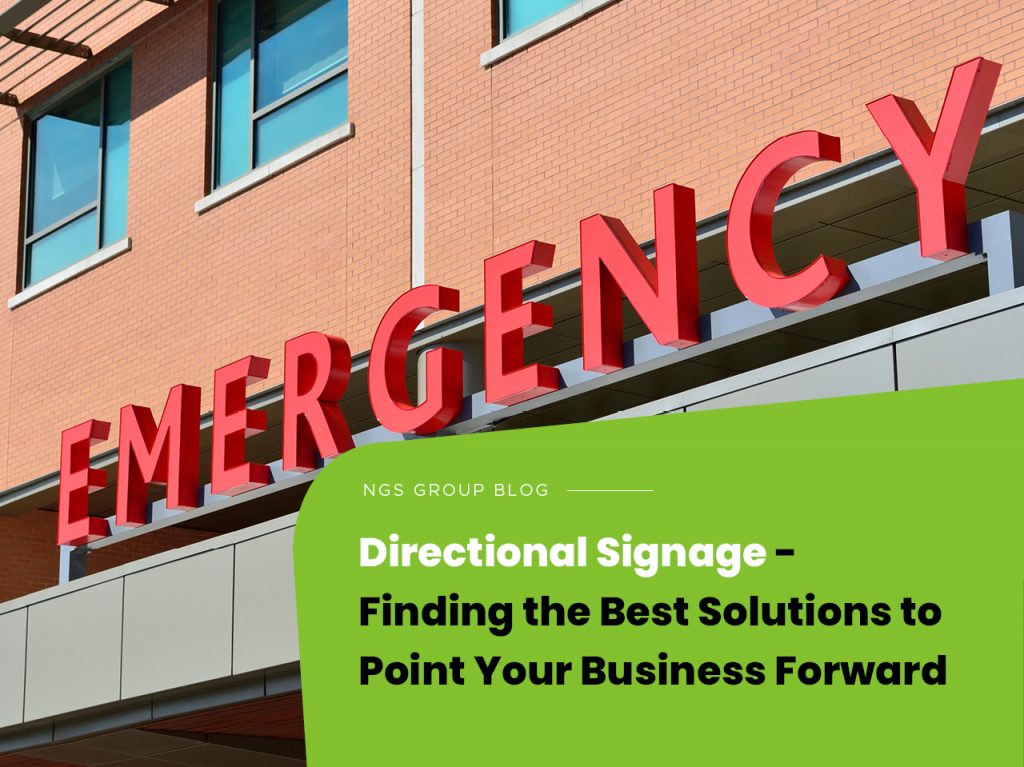
The start of a new year often comes with fresh business trends, the latest technology, and re-aligned goals. Nearly quarter-way into 2021, the signage industry continues evolving. This year, the industry seems to tilt towards granting directional signage products wider accessibility to enhance ethical business practices and environmentalism.
Consider learning the different categories of directional signage to expect in the market before embracing wayfinding signs for your company. You’ll be in a better position to blend the latest digital signage trends into your design. Wayfinding signs fall into four primary categories, including:
- Identification;
- Informational;
- Directional; and
- Regulatory.
Used as standalone signs, directional signage is role-specific. But as part of the broader wayfinding plan, these signs inform each other. If you’re a facility manager, be sure to keep in mind these tips when installing each of the main wayfinding signage categories.
Identification Signage
The most obvious reason to deploy a directional signage system is for identification. The network serves as a map that informs people when they come to interact with your business. It is particularly ideal for hospitals with multiple departments within the same premises.
Moreover, they serve as general wayfinding beacons for shopping centres and retail stores. Need customers to quickly get their bearings to your establishment in a densely populated business street? Consider going with identification signage. If you want to drive sales but all you see are human resources signs, it’s clear you are in the wrong place.
To embrace contemporary trends, make your identification signs uncluttered and straightforward. What does your sign signify? Ensure someone can understand it quickly.
Common examples include:
- Assistant Regional Manager Door Plaques in reception areas
- Office buildings’ departmental markers like Accounting, Finance, and Sales
- Educational institutions install donor plaques and historical markers as landmark signage
Informational Signage
While identification signs mark a specific place, informational landmarks pertain to the entire facility like an educational institution or facility. You can give people broad info as they navigate the facility.
Make sure to place an informational signage plaque in areas with wide exposure. Think of a hospital waiting room, school entrance, or office lobbies. Your signage is supposed to answer people’s questions before they ask. For example, they can answer common questions like:
- Where is the elevator?
- How early do you open?
- Where’s your bathroom?
Use common signs and symbols. The best informational signage is universally understandable within seconds.
General examples include:
- Elevator or free Wi-Fi plaques in accommodations and amenities
- Facilities like colleges and hospitals will need signage for cafeterias, bathrooms, or exits
- Your business information, showing address numbers or hours of operation
Directional Signage
When you want to get to your destination, a directional signage system might be useful. It purveys an invisible hand to walk you from where you are to where you are going, step-by-step. The best place to install wayfinding signs are areas that lack a clear flow of traffic and junctions. For that reason, they’re ideal directional landmarks parks and gardens or major installations like hospitals.
In this way, any customer unfamiliar with their surroundings gains from different directional signage. You can make it unfussy by having a plaque at every junction, telling people to take the right or left turn. Alternatively, your signage can be as elaborate as coloured lines on your floor to send people directly to where they’re heading.
For directional signage, continuity is king. Your signage is invalid if someone loses their way anywhere between two points with directional landmarks. Finding the trail again might mean first falling back or getting lucky.
Here are a few examples:
- Junction signs, such as ‘left to clinic or right to downtown exit’
- Diverse coloured lines on your floor, such as red for finance and blue for sales
- Directory landmarks on office buildings, e.g., HR 2ND Floor
Regulatory Signage
If you are looking for proactive wayfinding landmarks, consider regulatory. It aims to warn about liability and safety concerns, setting relevant boundaries. Use them to communicate what is and what is not acceptable in your establishment.
They are ideal for establishing and reinforcing privacy expectations, regulations, and safety standards. As a result, regulatory signage should be big and bold. Avoid frills and stick to a prominent, clear, and terse message. You probably avoid opening a closet with a “Caution! Highly Corrosive!” plaque on the door. Similarly, having a “No Smoking” sign means tobacco products aren’t allowed.
For effective communication, use regulatory landmarks where applicable without leaving room for ambiguity.
Common examples are:
- Compliance standards such as a high voltage or ADA accessibility sign
- “Employees Only” plaque on a locked door for access control
- No firearms or no pets allowed regulations
Merging Directional Signage
Each type of directional signage can work with any other. Deploy regulatory signages to keep customers out of restricted places as they use directional signs to their destination. Similarly, identification landmarks tell people where they are so they can follow directional signs to where they’re heading.
To institute behaviour expectations in your facility, you’ll need to combine informational and regulatory signages. If you’re having trouble creating the right directional landmark, reach out to NGS Group’s visual branding solutions. With more than two decades of experience, they can supply your business with visually appealing signages for creating a brand identity and professional marketing.

