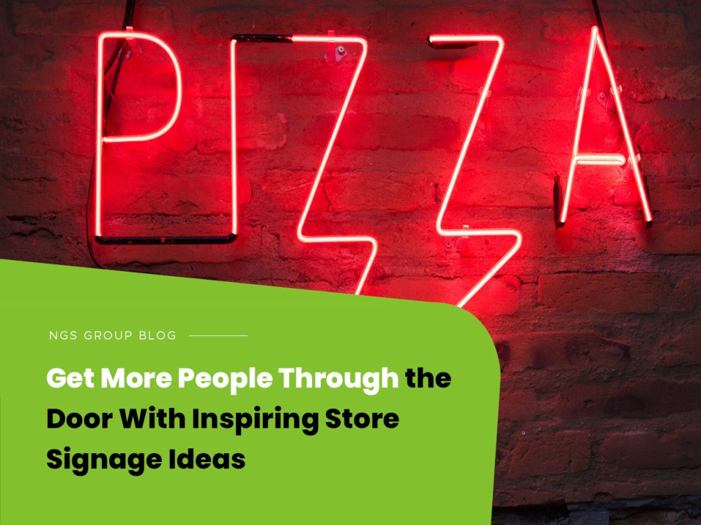
Drawing customers to your business can be challenging, especially during pandemic restrictions. But the right store signage can attract customers and direct them once inside. Whether you’re promoting a temporary offer or capturing people’s attention, research shows that readable graphics are vital to driving customers to retailers. So, let’s discuss storefront signage ideas that’ll draw customers to your business.
Creating a memorable message
Making your message stick is the trick to getting more people through the door. You can achieve that with inspiring store signage messages. A customer may pass by your business up to thirty times every month if it’s within their commute or home. Ensure your signage is always visible even after business hours. It’s an excellent opportunity to boost your brand-building efforts round the clock.
Define your sign’s purpose
Plan for each sign before you start ordering signage products. For instance, an outdoor banner might help to market a sale. Similarly, you can use a window decal to let the passersby know your operating hours. Crafting an effective message for each store signage will be much easier after you define the purpose of each.
Overall, depending on the purpose, you can use the sign to:
- Advertise
- Identify
- Inform
- Direct
Using contrasting colours
Two things will affect the readability of your signage products:
- The font you select.
- The contract between the text and background colours.
A properly-made outdoor banner, for example, can reflect positively on your brand. However, note that the sun’s glare can make your sign hard to read. Ensure there’s plenty of contrast between the text and background colours if there’s a lot of direct sunlight hitting your banner. Also, remember that combining similar colours can reduce your sign’s readability.
Research shows that you only have 3.5 seconds to appeal to prospective customers, walking or driving by your storefront. Your signage must capture their attention. Using dark text over a yellow or white background gives plenty of contrast.
Here are the five best legible colour blends for retail signs according to the Psychology of Colour in Marketing and Branding:
- Black on White
- White on Blue
- Black on Yellow
- Green on White
- Yellow on Black
Enticing customers in
The publics strolling past your store are not just pedestrians but prospective buyers. Your storefront is supposed to draw them in for a look. To entice potential customers, consider:
A-Frame Signs: Apart from being two-sided, A-frame signage is a popular choice because it’s readable from both directions.
Chalkboard Sign: Consider this option if you’ll be updating your message regularly. Besides, it’s easy to give your messages some personal touch. For instance, bars use witty handwritten notes to decorate chalkboard signs and draw in customers from the street.
Making sure your store signage is readable
Creating readable signs is king. Therefore, consider how easy someone across the street can see your business. Will your message still be easy to read for a customer in a moving vehicle or bicycle? Choose a text size that’s readable from far when designing your storefront signs.
Closing Remarks
The posters, banners, and signs you use around your business are your first interaction opportunity with the purchasing public. Note that first impressions can stick. Prospective clients will judge your store’s inside by the outside appearance. Therefore, the overall style and message on your store signage determine whether customers come in to look around or walk past.
If you would like to talk to NGS Group about some inspiring signage ideas call us on (03) 9432 7111.

